How To Be Empty
May 29, 2019
In an effort to bring order to the chaos that is transferring medical records between doctors, I recently signed up for Galileo Health.
Purporting to simplify management of personal electronic health records, Galileo also helps users schedule simple check-ups, renew prescriptions (that are not controlled substances), request lab work, and other tedious personal health tasks.
Overlooking Emptiness
While the Galileo application has a nice user experience overall, the search functionality leaves a bit to be desired.
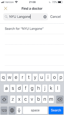
This is the result of searching for the NYU Langone hospital system:
Just a nebulous empty-state containing the text: Search for “NYU Langone” - an action which I believed had just occurred.
Galileo can be forgiven for not having every single doctor and hospital available on their platform, but they should be taking advantage of this empty-state to give the user better feedback.
This got me curious to how other products display empty search results.
The Art of Being Empty
Clear Copy
At the very least, users need an unequivocal response that their search has not returned any results.
The developer-focused blogging platform dev.to does this well:
Simple Suggestions
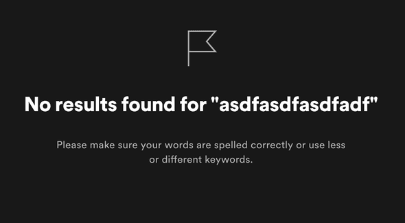
Even better, add some light copy to encourage the user to try different approaches to their search as we see with Spotify:
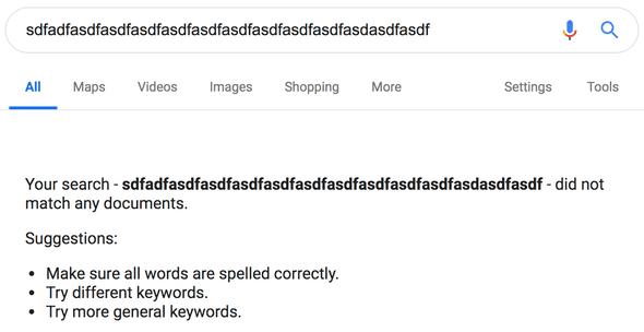
Google’s search renders a similar empty-state:
Actionable
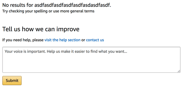
My favorite empty-state is Amazon’s e-commerce search results.
Not only is the user provided with clear copy and simple suggestions on how to alter their search, but Amazon also affords the user the opportunity to provide valuable feedback:
Whether users are actually using this feature is another question…


